I guess many of you, like myself, have looked at the LinkedIn notification that says you have ‘interesting viewers’ of your post. For many months I quickly glanced over this data but never thought to analyse it a bit, hence it was just data, not insights.
Well, imagine if you could take this data, analyse it and then use the information gained to make an informed decision on how to improve your influence and reach with your next post…
This is exactly what I did for a post I released this week (see below), using plain old Microsoft Excel. No advanced analytical software required.
Below I will demonstrate how insights can be derived from ‘free’ data provided by LinkedIn.
So, here are some insights gained on three unique dimensions;
- geography,
- job role and
- current employer.
Viewers geographical location
LinkedIn track which city and country their visitors are from. They also inform members where the readers of their posts are from. This is wonderful data to have to understand where your network is located. One insight for me was I never knew I had more readers, \ viewers, in Poland than the Netherlands and UK combined. The second insight was only India surpassed Poland by the number of viewers for second place of most viewers per country. The third insight is I now know which cities my viewers live in.

Lastly, the countries I wanted to target or expected to see didn’t even make it on the list…
Note, the colour indicates the rank of viewer numbers. Darker green means more viewers.
Viewers current job role
The current job role provides further insights into which specialist field your audience belongs to. Are your audience sales focused or artificial intelligence specialist in the Analytics domain of Information Technology?
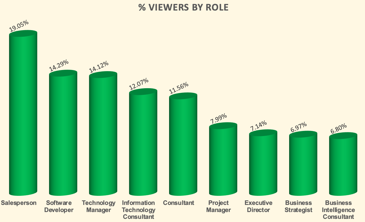
From my viewer statistics, it is clear that I’m reaching my target audience being Information Technology and a broad range of roles. This is very encouraging and positive reinforcement. The split between developer vs director is interesting since this is not the ‘normal’ split in a company. This means my ratio of developers to director is slightly higher than you expect in an organisation. Over 30% is deemed ‘consultants’ which is a large percentage but I’m left with inadequate data to dissect this further to derive valuable insights. One way to read this is ‘sales people’ and ‘developers’ are most active on LinkedIn..:)
Viewers by employer
My viewers work for some of the most prestigious technology companies on the planet today. The three top Cloud vendors are also where my viewers are from, what a nice coincidence…:). Some past employers are on the list, which I expected, but also encouraging to see past and current clients.

I have twice as many Microsoft viewers compared to AWS but they are far outnumbered by the amount of IBM viewers, up to 8 fold.
In summary
One has to remember, the data provided is a snapshot in time. I received ~1400 views of my post although I have fewer connections. This shows that posts do reach audiences beyond your current network. Yippee!
One needs to keep in mind, as with all analytics, what is the timeframe you are looking at. Time stops for nobody! Here it is a specific point in time that was within 24 hours from the transaction or even taking place, my post. If I had to pull the data now the insights are different and then you can start to perform trend analysis. More information on trend analysis will be shared in subsequent posts.
A glimpse of the LinkedIn post I released this week is here.